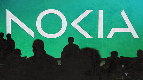

Nokia on Sunday announced to change its brand identity for the first time in over 60 years, complete with a new logo, as the telecom equipment maker focuses on fast expansion.
The new logo consists of five distinct shapes that create the word NOKIA. The characteristic blue tint of the original logo has been replaced with a variety of colours depending on the application.
The revised logo was introduced, on Sunday, along with a new set of strategic pillars designed to promote faster expansion as the globe rapidly embraces fifth-generation mobile technology.
Nokia CEO Pekka Lundmark said that they intend to launch a new brand that places a major focus on networks and industrial digitization, which will be very different from regular mobile phones.
According to Lundmark, Nokia's focus would be on increasing its market share in the field of providing network equipment to cellular service providers. He asserted that Nokia now had "the tools and the weaponry" to expand market share while retaining profit margins.
Limitations on Huawei Technologies Co., a Chinese competitor, aided this since the company had been restricted by a number of European nations from providing components for 5G networks.
Nokia also plans to increase its business by providing companies with private 5G networks. The enterprise sector provided 8% of Nokia's sales last year, and the CEO stated that the next goal is to grow the division "to double-digit territory," mostly through organic growth and smaller acquisitions.